
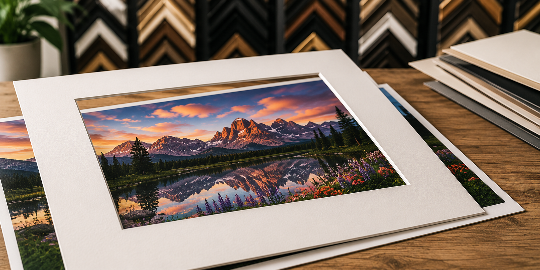
Picture Matting Basics: Sizing, Colors, and Bevels
A frame without matting puts the artwork right under the acrylic. That looks fine on posters but causes three problems for anything you care about:
- Moisture damage. When artwork touches the acrylic, condensation builds up and the paper can stick or mold over time.
- No breathing room. The artwork feels crowded, especially small pieces inside large frames.
- No focus. The eye jumps from artwork to frame edge with no transition. A mat creates a quiet border that draws the eye in.
Picture matting solves all three. The mat acts as a spacer, a frame within the frame, and a chemical buffer (when you use archival matting).
How Wide Should the Mat Border Be?
Mat border width depends on artwork size and the look you want:
- 1 to 1.5 inches, narrow, modern, gallery-style. Best for large posters and contemporary art prints.
- 2 to 2.5 inches, the most common border for family photos, certificates, and everyday framing. Balanced.
- 3 to 4 inches, wide, elegant, formal. Makes small artwork feel important. Common for diplomas, fine art, and wedding photos.
- 4+ inches, gallery and museum proportions. Used to highlight small precious works.
The rule of thumb: the mat should never be narrower than the frame moulding. A thin frame with a wide mat looks elegant. A thick frame with a thin mat looks unbalanced.
The Weighted Bottom Mat
Many traditional framers cut the bottom mat border 1/4 to 1/2 inch wider than the top. This is called a "weighted bottom."
The weighted bottom makes the artwork look centered to the eye. Without it, the artwork appears to drift slightly low inside the frame, because the human eye reads pictures top-down. Portraits and gallery framing almost always use a weighted bottom. Modern framing often leaves all four borders equal.
Single Mat vs. Double Mat vs. Triple Mat
A single mat is one piece of matboard with one opening. Clean, simple, and works for most framing.
A double mat is two layers stacked together. The top mat has the main color; the bottom mat shows through as a thin "reveal" (usually 1/4 inch) around the artwork. Double mats add depth, an accent color, and look more custom.
A triple mat adds a third layer with another color reveal. Common on diplomas, certificates, and ornate gallery framing. Three colors require careful coordination so the mat doesn't compete with the artwork.
Picking the Mat Color
Three approaches:
- Safe and clean, off-white, ivory, antique white, or warm gray. The mat fades into the background and lets the artwork lead. This is the right pick when you're not sure.
- Pulled from the artwork, match a soft color found inside the artwork itself. The mat ties the framed piece together without competing.
- Strong contrast, black or dark gray for photography; rich saturated color for graphic art. Used on purpose when you want the mat to be part of the design.
Avoid trendy colors that don't appear in the artwork (bright teal, lavender, hot pink). Trendy mats date the framing and fight the artwork. See our mat color selection guide for a deeper walkthrough.
Standard vs. Conservation Matting
Standard (paper) matting is fine for posters and prints. Archival matting is required for any artwork you want to keep, originals, photographs, certificates, heirlooms. The price difference is small.
For more on the materials side, see our matboard guide.
Picture Matting FAQ
What is picture matting?
Picture matting is the colored cardboard border that sits between your artwork and the picture frame. The mat creates space between the artwork and the acrylic, adds a finished color border, and helps focus the eye on the artwork.
Why do you put a mat on a picture frame?
Three reasons: looks, space, and protection. The mat gives the artwork breathing room so it doesn't feel cramped inside the frame. It creates an air gap between the artwork and the acrylic to prevent moisture damage. And the color border makes the framed piece look more polished and finished.
How wide should the mat be on a picture frame?
Most picture matting uses a 2 to 3 inch border. Wider mats (3 to 4 inches) make small artwork feel more important and look elegant on certificates and diplomas. Narrow mats (1 to 1.5 inches) work for large posters and modern art prints.
Should the mat be wider on the bottom?
Yes, by tradition. A 'weighted bottom' adds 1/4 to 1/2 inch extra to the bottom border. This makes the artwork look centered to the eye, since people read pictures top-down. It's especially common on portraits and gallery framing.
What color mat should I use?
Start with off-white or warm gray. These are safe and let the artwork lead. For more color, pull a tone directly from the artwork (a soft color found in the image itself). Black mats work for photography and bold modern art. Avoid trendy colors that compete with the artwork.
Can you put two mats on a picture frame?
Yes, this is called double matting. The top mat has the main color and the artwork opening; the bottom mat shows through as a thin reveal (usually 1/4 inch) around the opening. Double mats add depth, an accent color, and look more custom than a single mat.